This setting is available in the blocks within the Main navigation and Multicolumn sections — it allows the available blocks to fill the remaining horizontal space in the section. You can use this setting to build unique section layouts which fit your needs and content.
This setting can be a little confusing at first, but we think you'll get the hang of it quickly — and once you do, it can be a powerful tool which enables limitless flexibility.
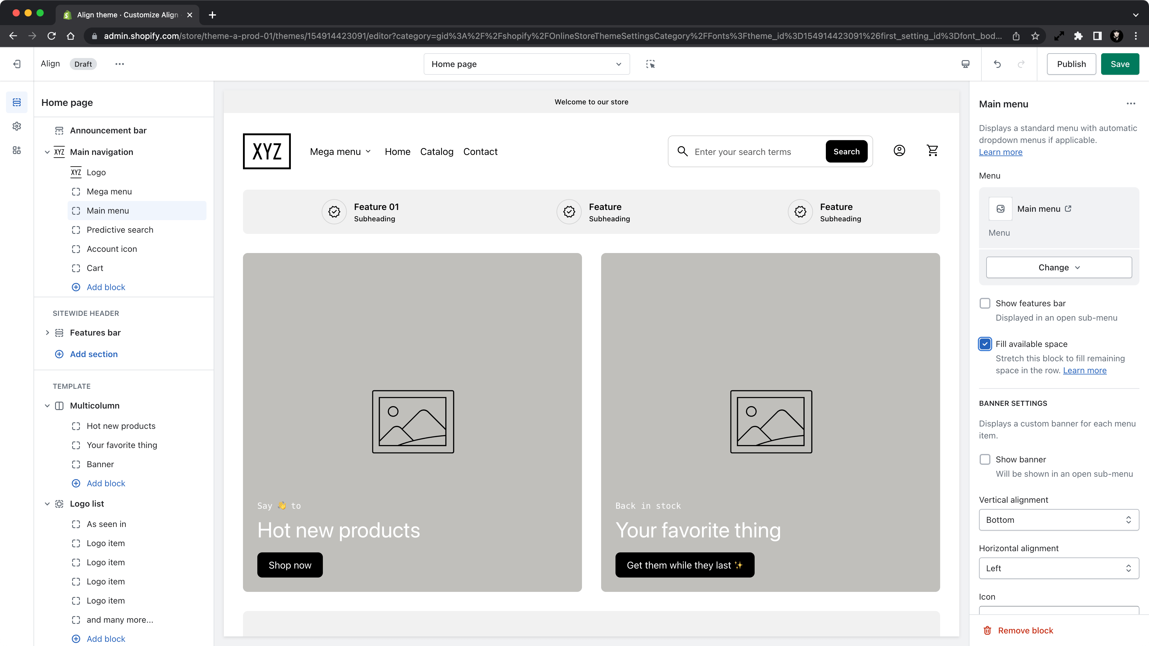
Within the Main navigation section
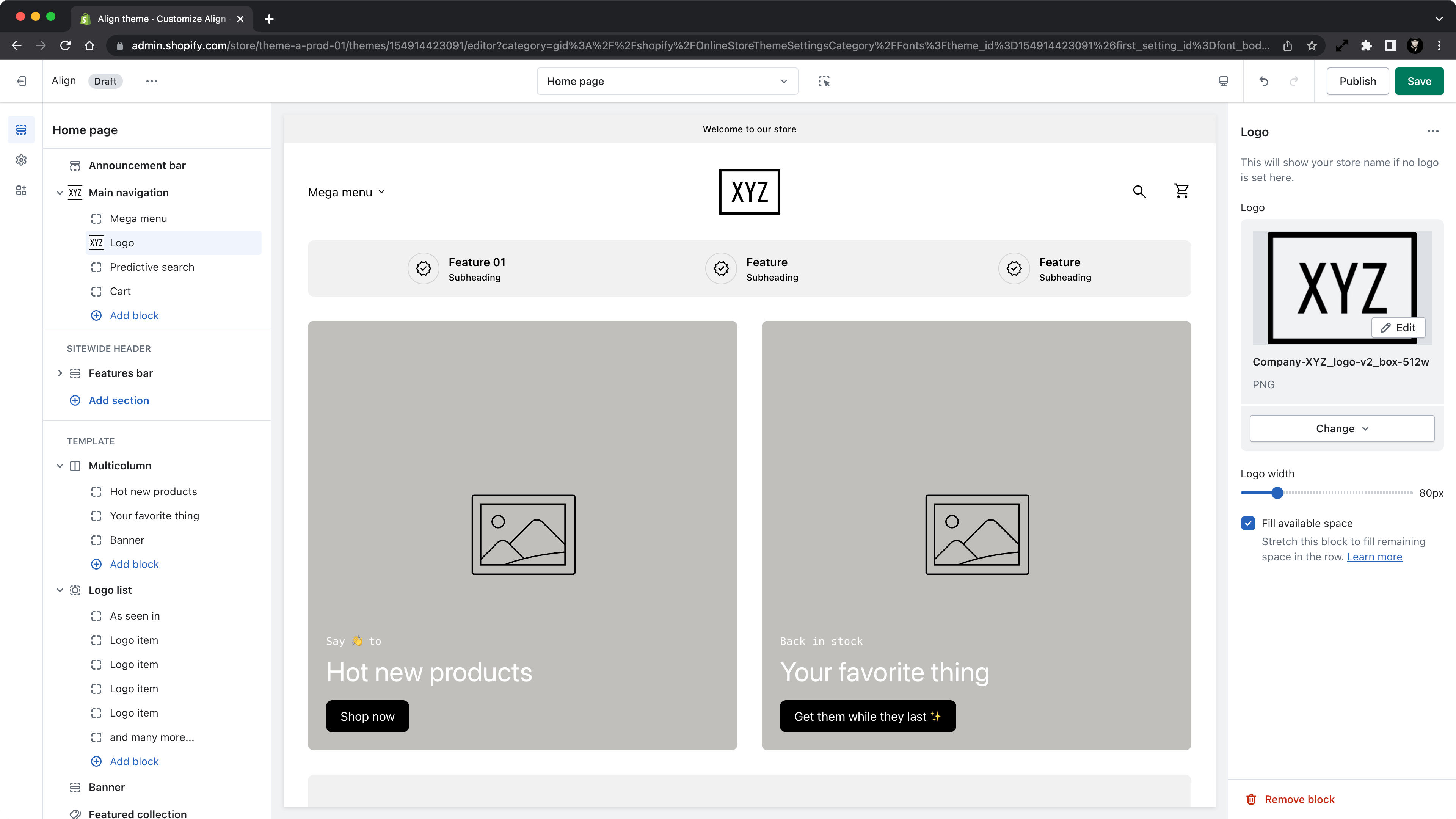
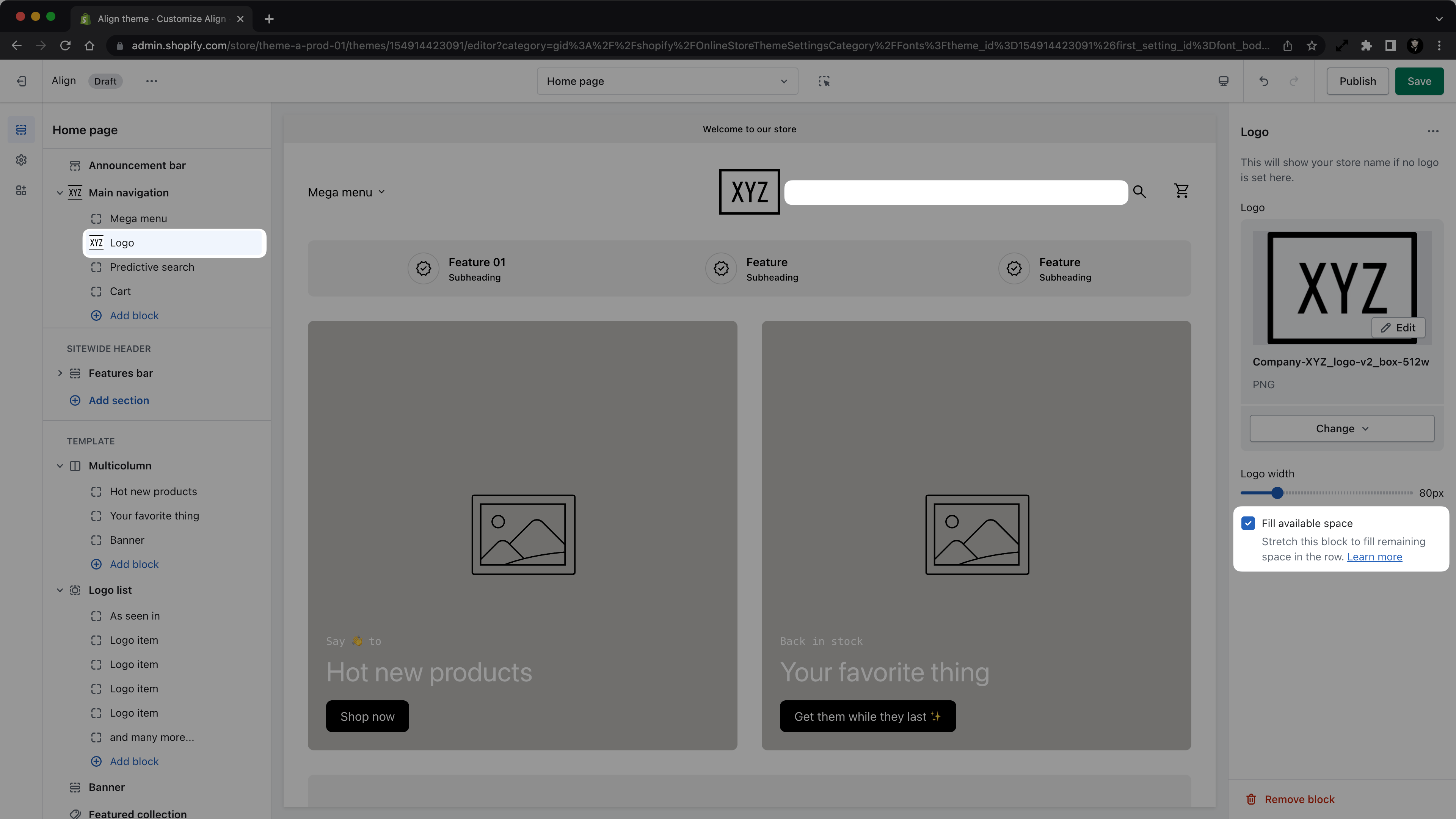
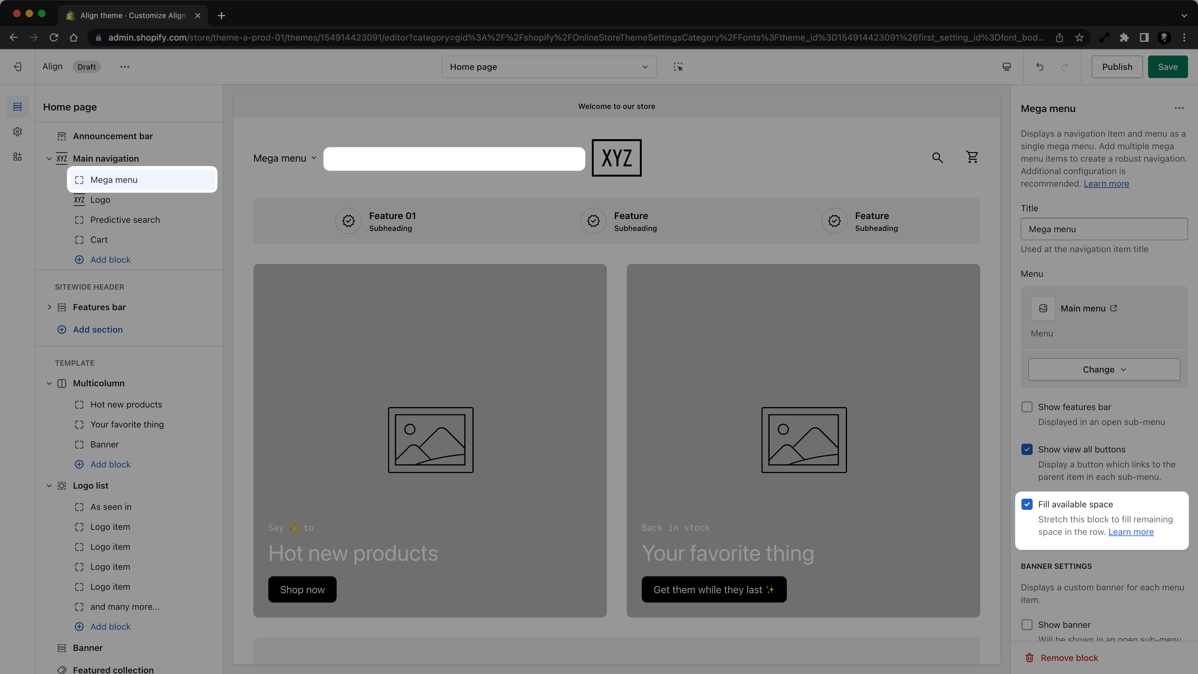
Introduced in Align v1.2 is a new setting for all blocks within the Main navigation section called Fill available space.
The setting basically tells the block to use whatever space is remaining in the section, and is used to "anchor" different blocks as needed on the left or right of the navigation on desktop — mobile navigation is not affected by this setting! (You don't need to know this, but this setting is based on the CSS flex and flex-grow rule.)
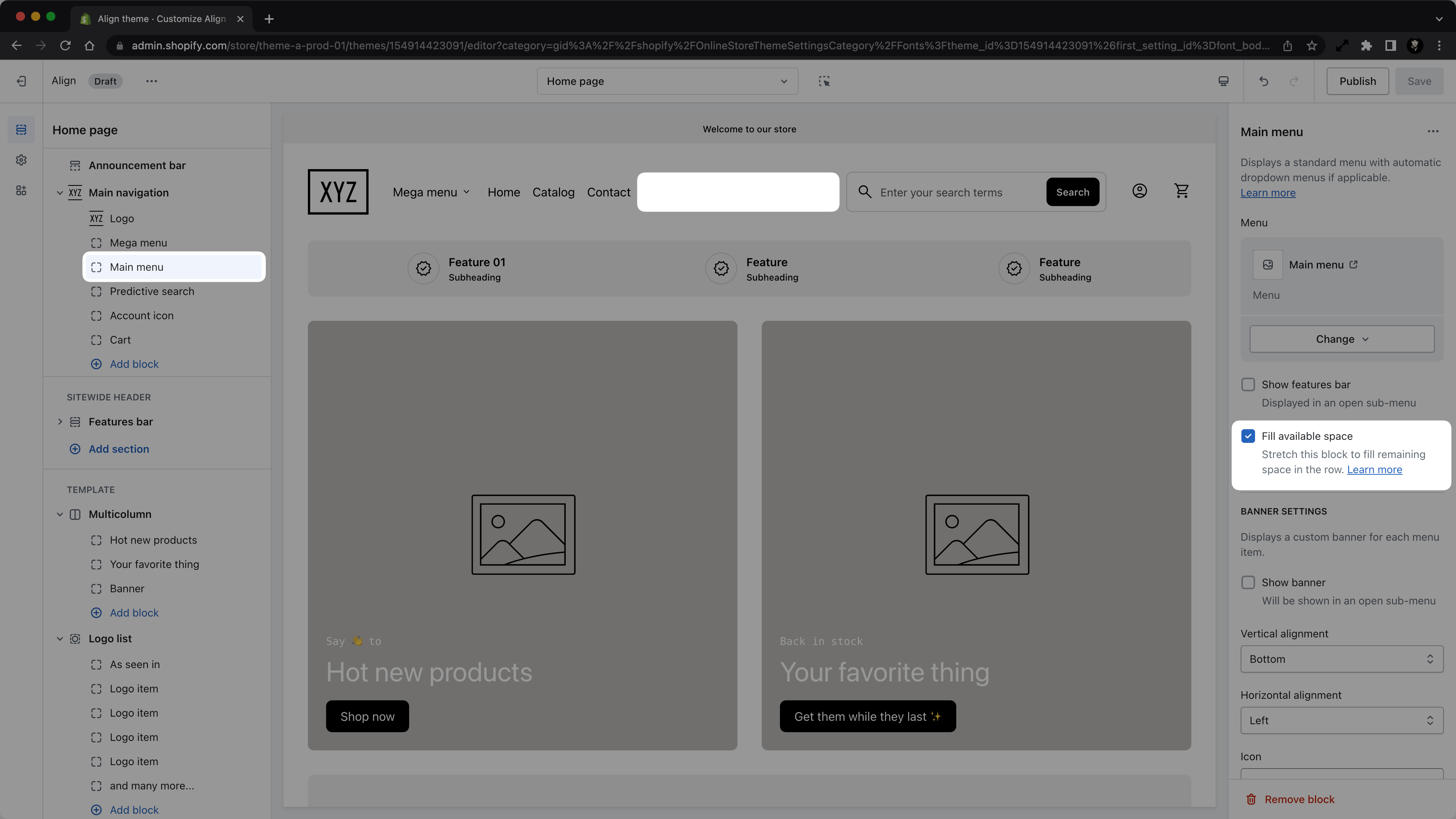
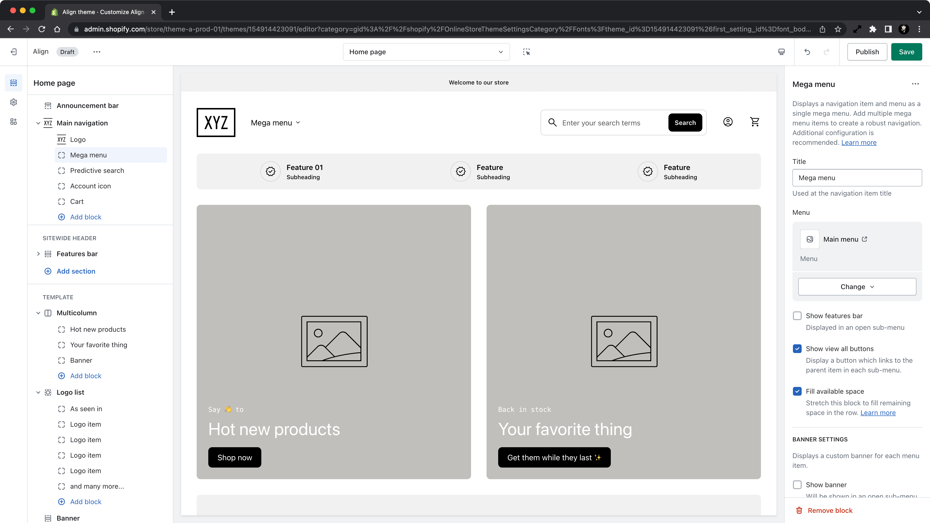
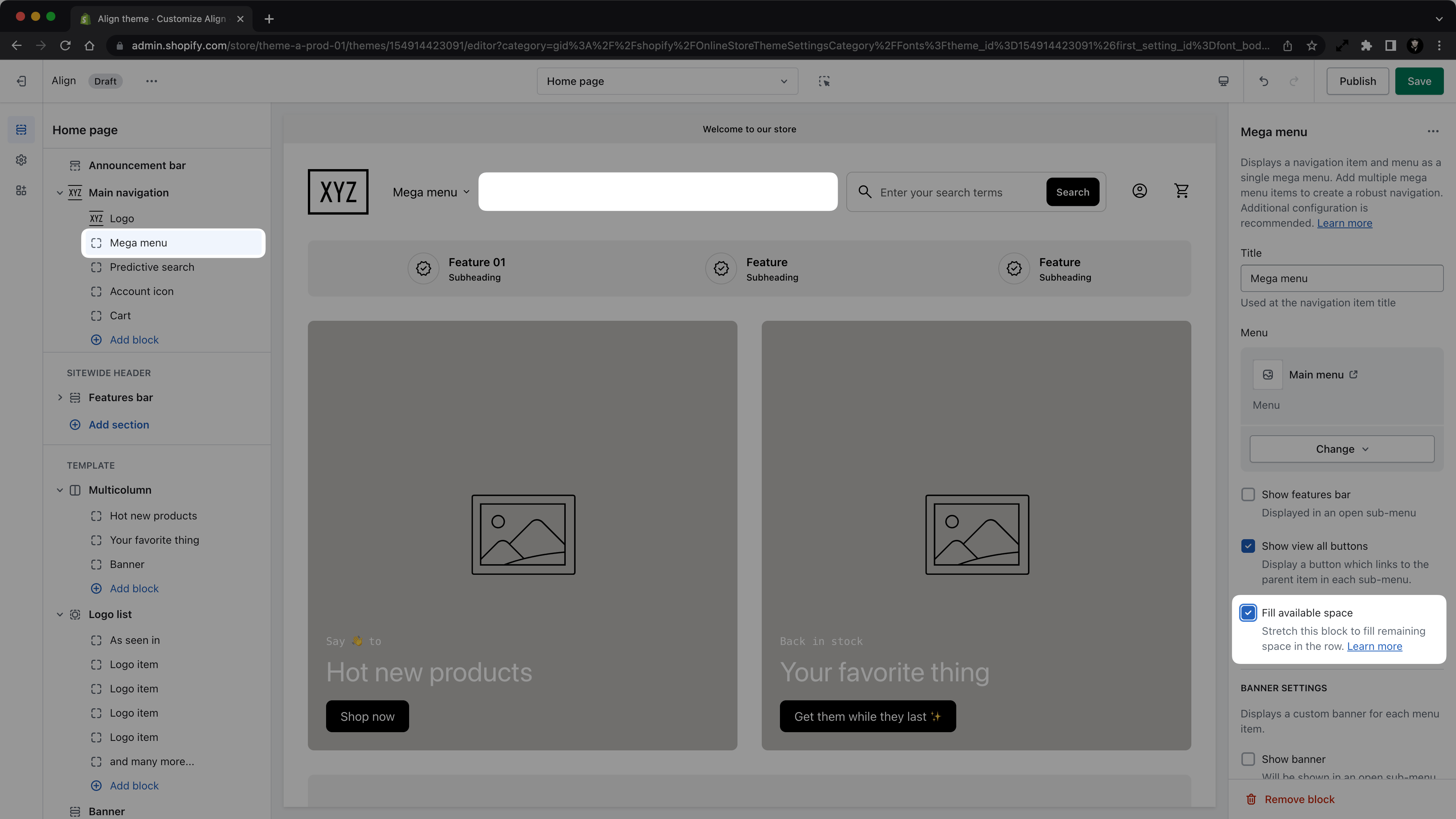
A few examples
Default - Small search field anchored to the right
Mega menu only
Centered logo
In general — though not required — you'll only want one block to have this setting checked. If multiple blocks are checked, they will "share" the remaining space.
You can use this to get more creative with your layouts. Below is an example showing how you might apply this setting to two blocks to center your logo.
In this example, please note that the left and right sides need to be the same width, so this only really works with certain block combos. We're looking into a better solution in a future release!
The best way to learn about this is to play with it! So go check it out!
Within the Multicolumn section
Setting option(s)
Checkbox to enable the "fill available space" setting.
Basic usage
- Set multicolumn section "desktop column count" setting to 3
- Add two blocks into the section
- Check the "fill available space" in the settings of the last block
- This will result in a layout where the first block takes up ±33% of the section width, while the second one will take up the rest ±66% of the section width
- Set multicolumn section "desktop column count" setting to 4
- Add three blocks into the section
- Check the "fill available space" in the settings of the second block
- This will result in a layout where the first and last blocks take up ±25% of the section width, while the second one will take up the rest ±50% of the section width